LunarCrush Portfolio Optimization
Summary:
LunarCrush uses machine learning to analyze social media data and provide sentiment analysis for investment assets like crypto and stocks.
The goal of this project was to optimize and redesign the portfolio feature on the LunarCrush website and mobile app.
Duration:
3 months
My role:
UI Designer and UX Researcher
Sectors:
Fintech, Crypto, Investing, Artificial Intelligence
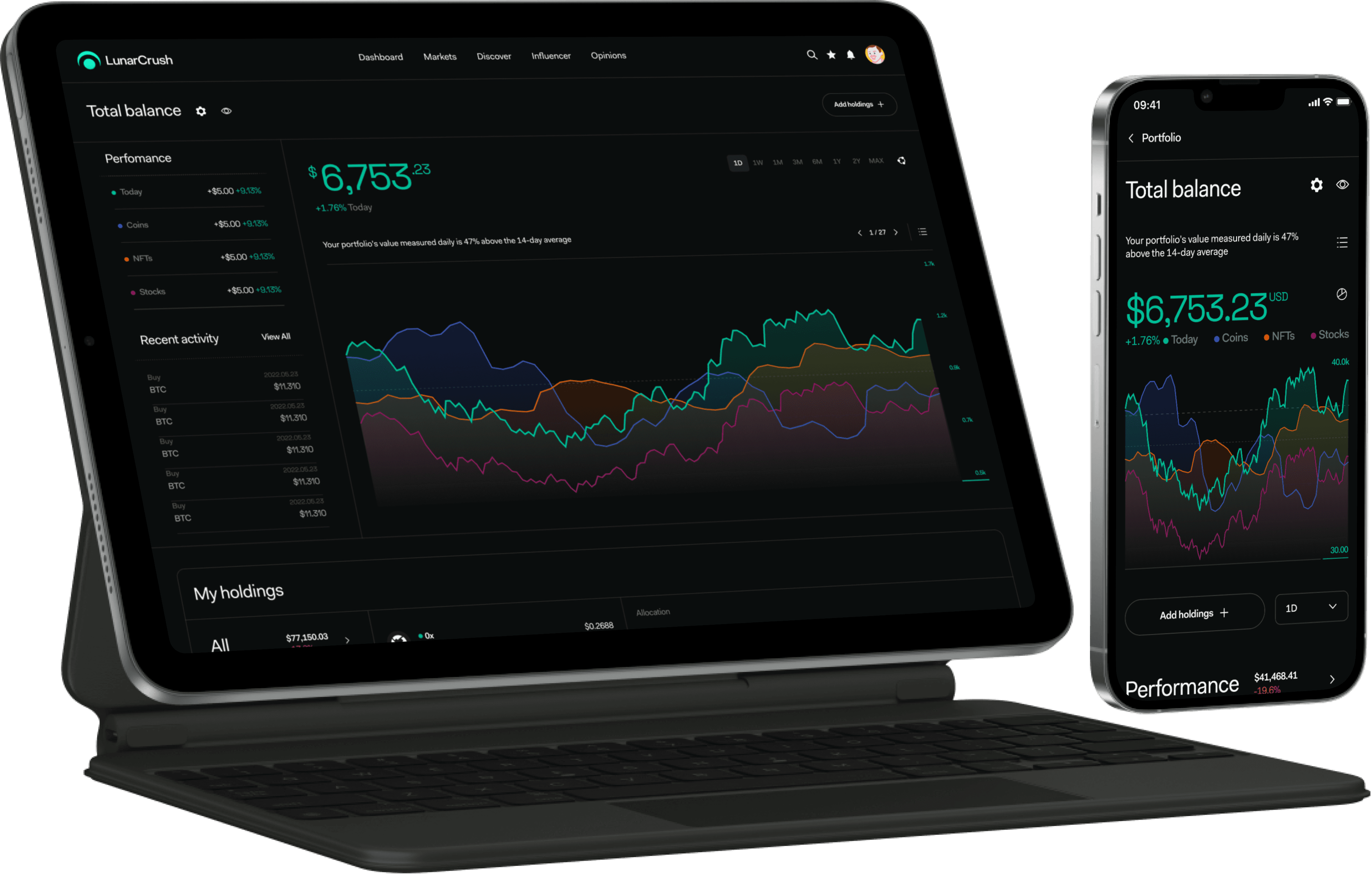
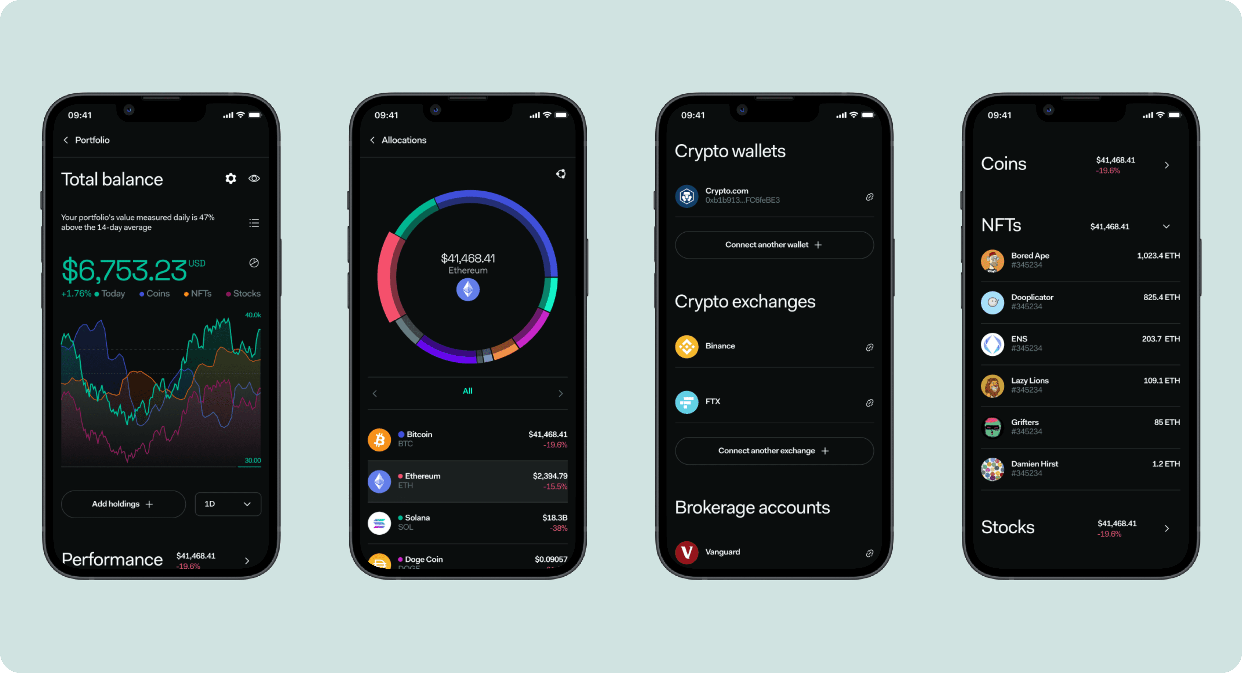
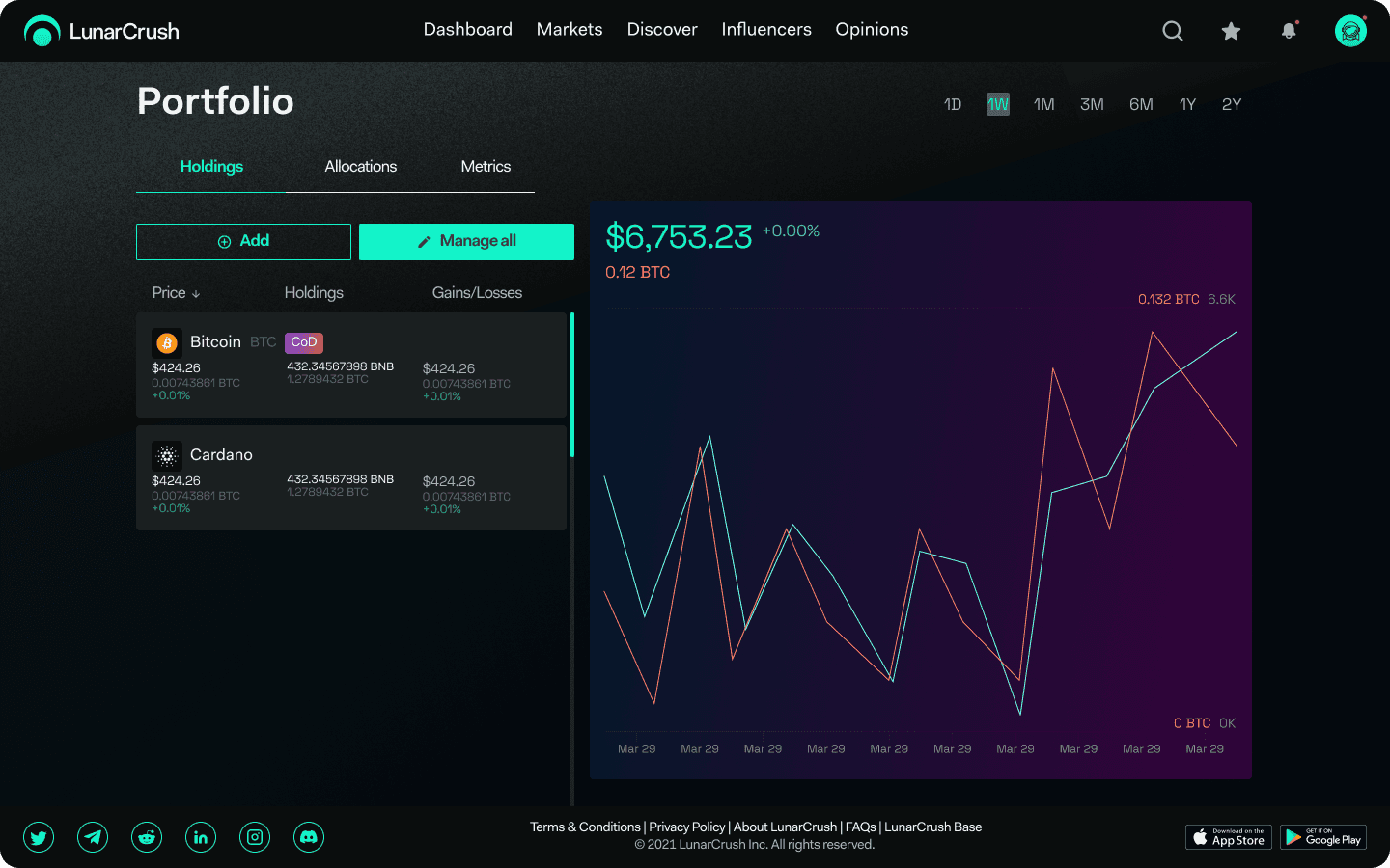
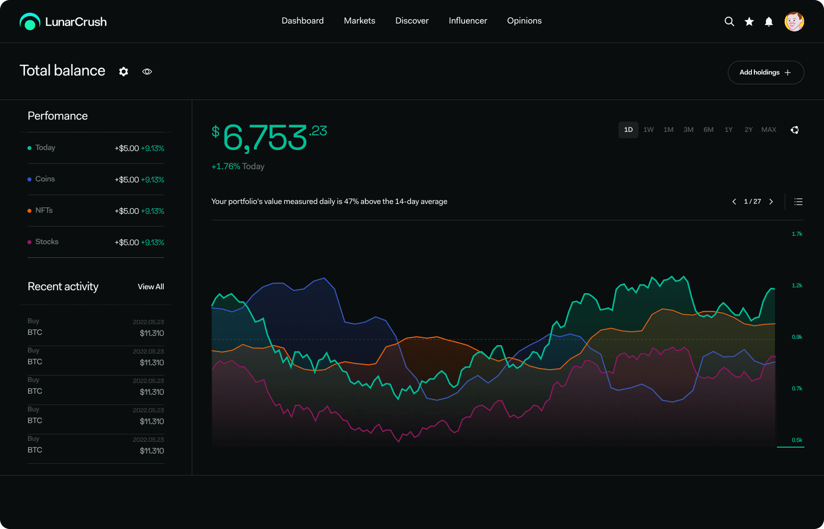
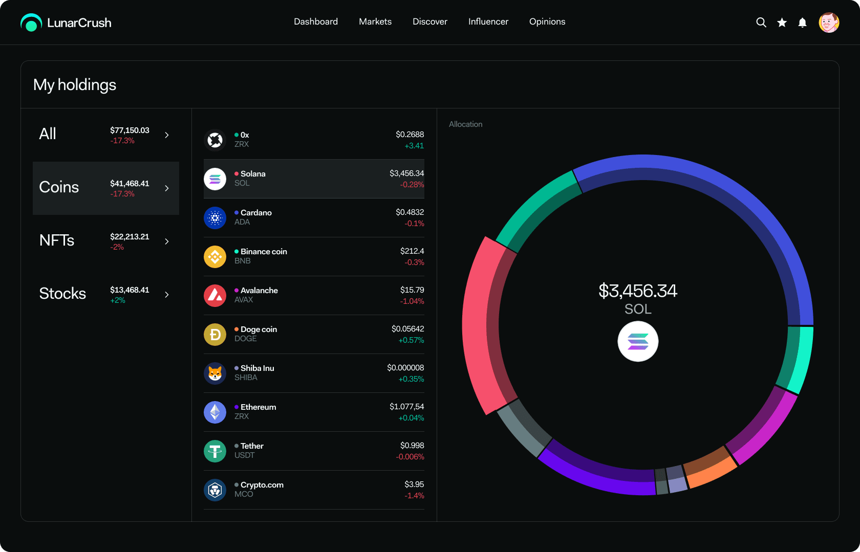
Desktop Home
Before
After
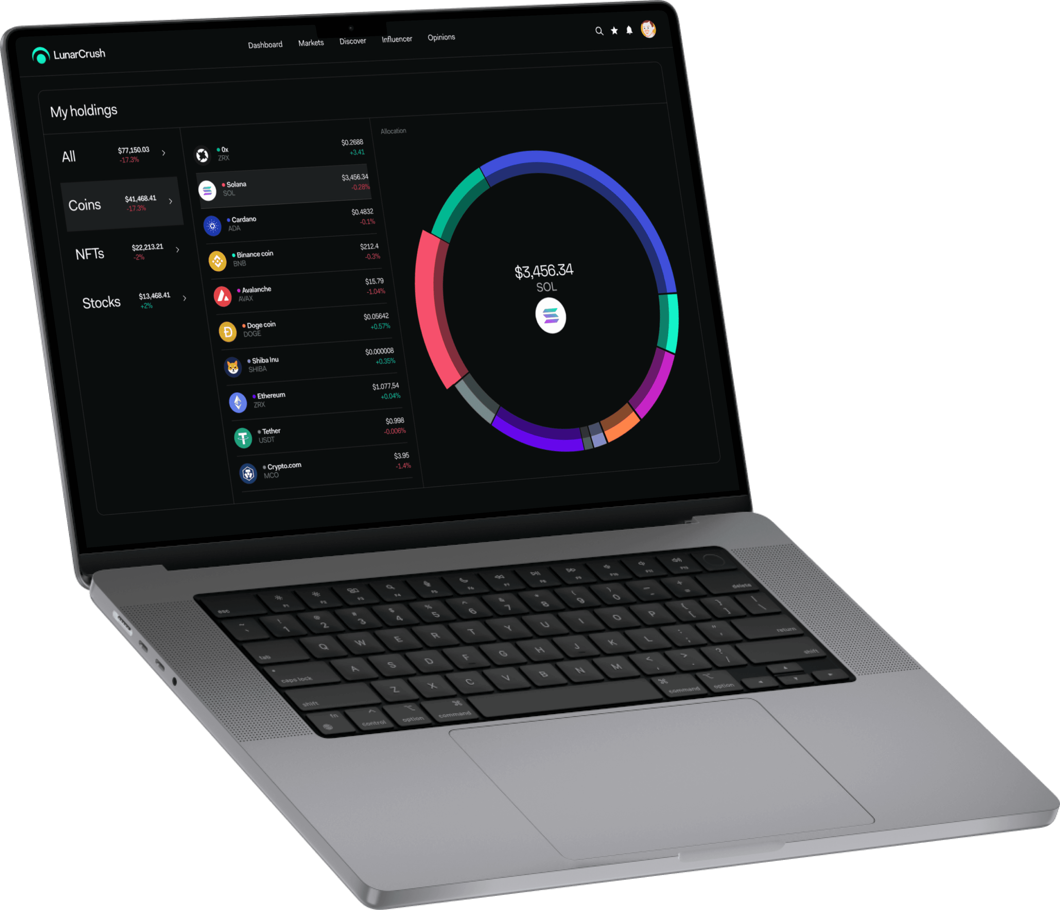
Desktop Allocations
Before
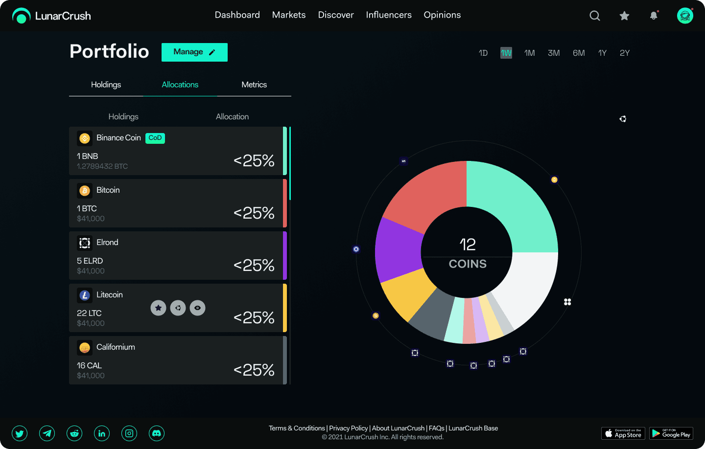
After
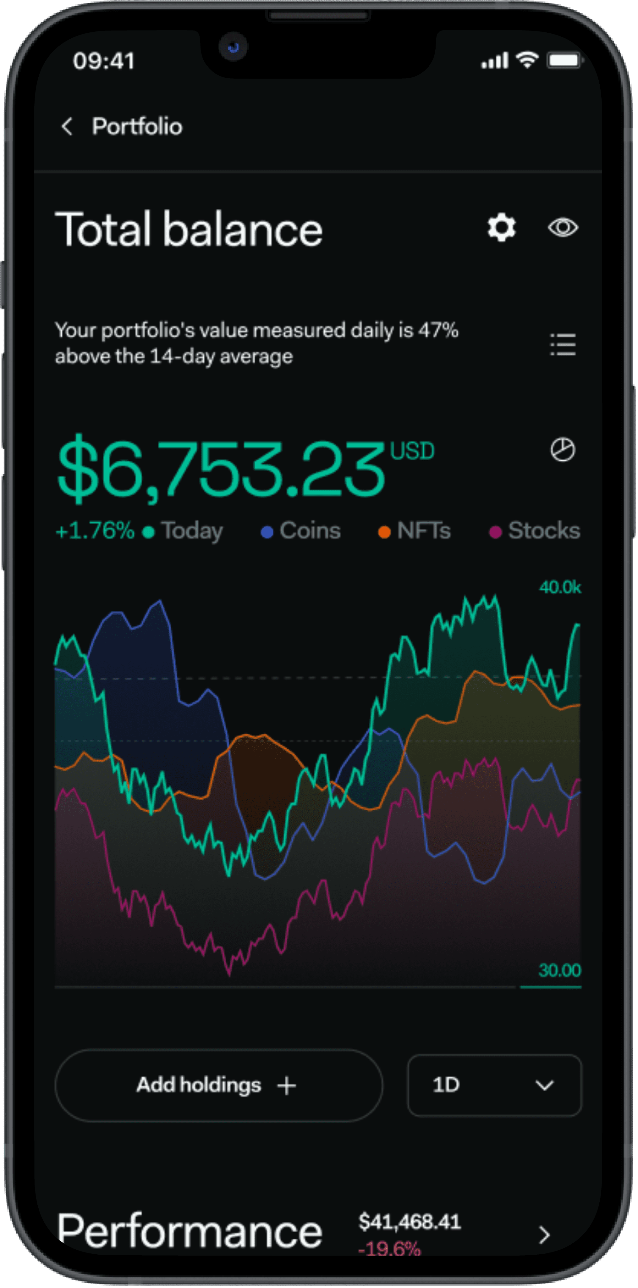
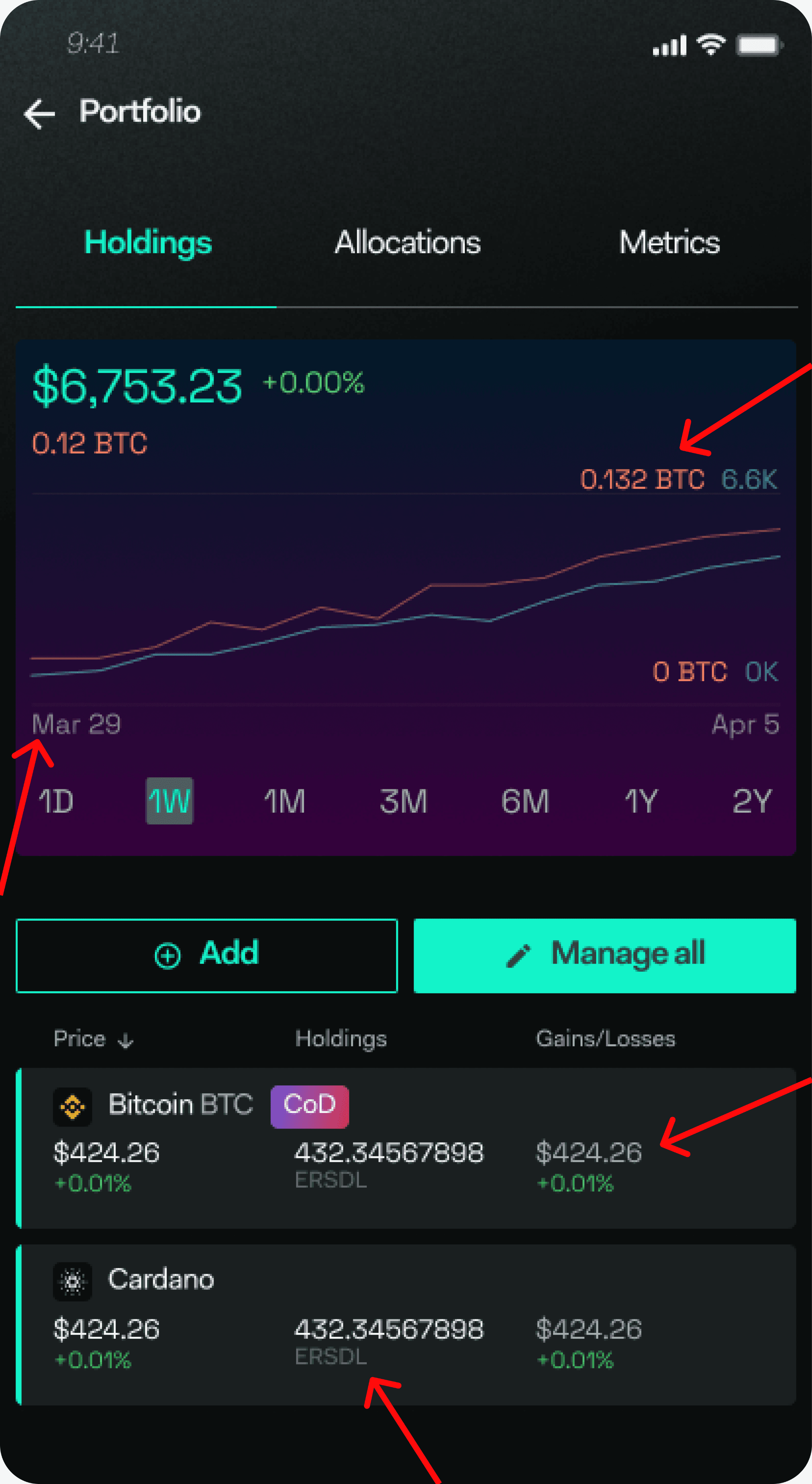
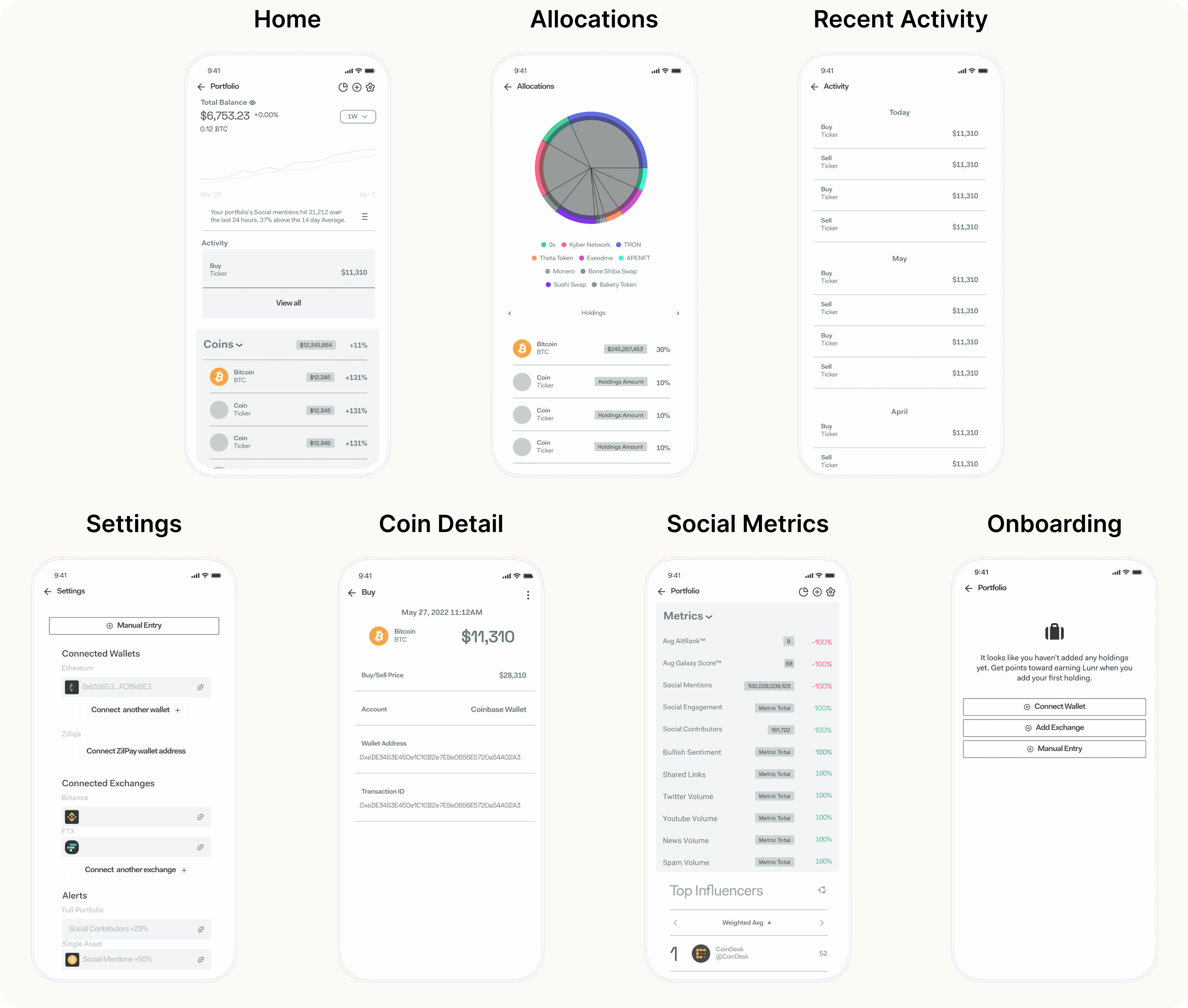
Mobile Home
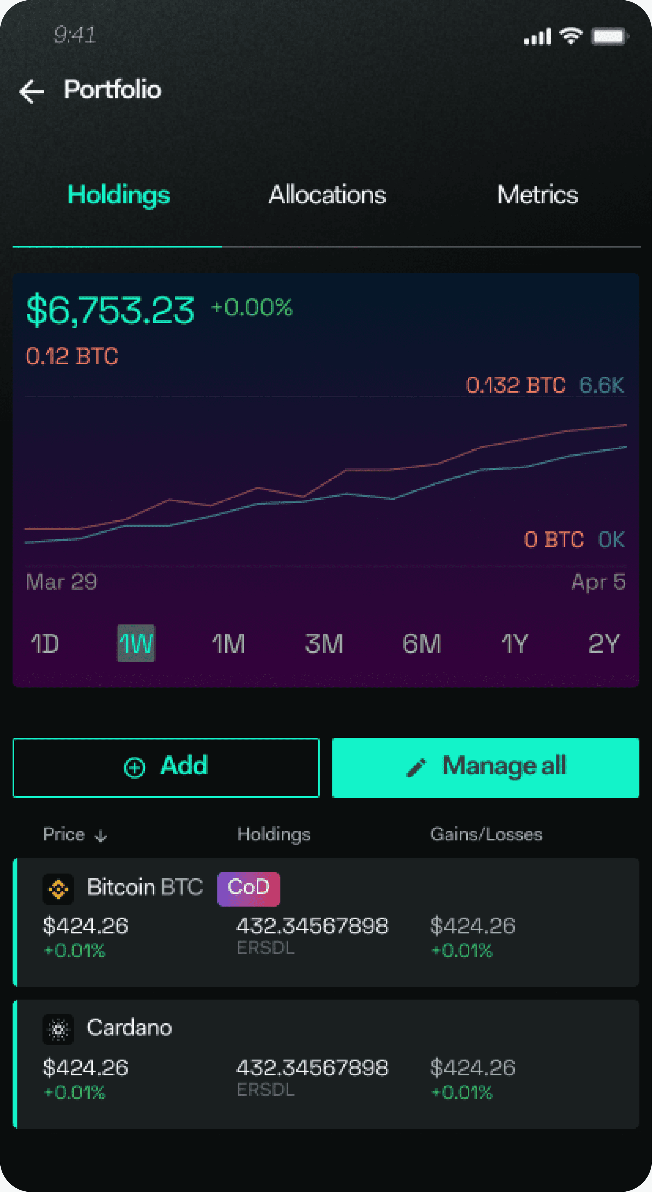
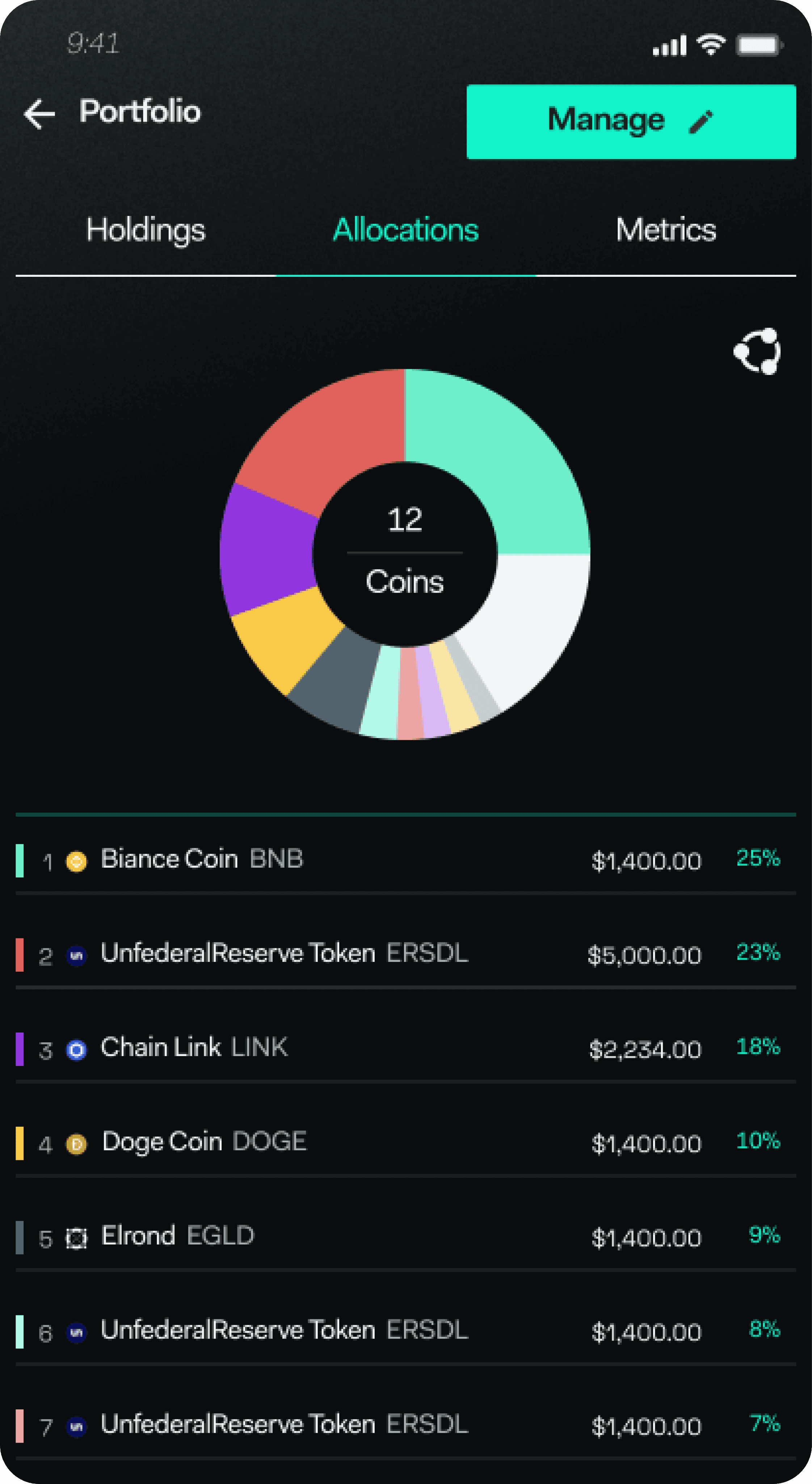
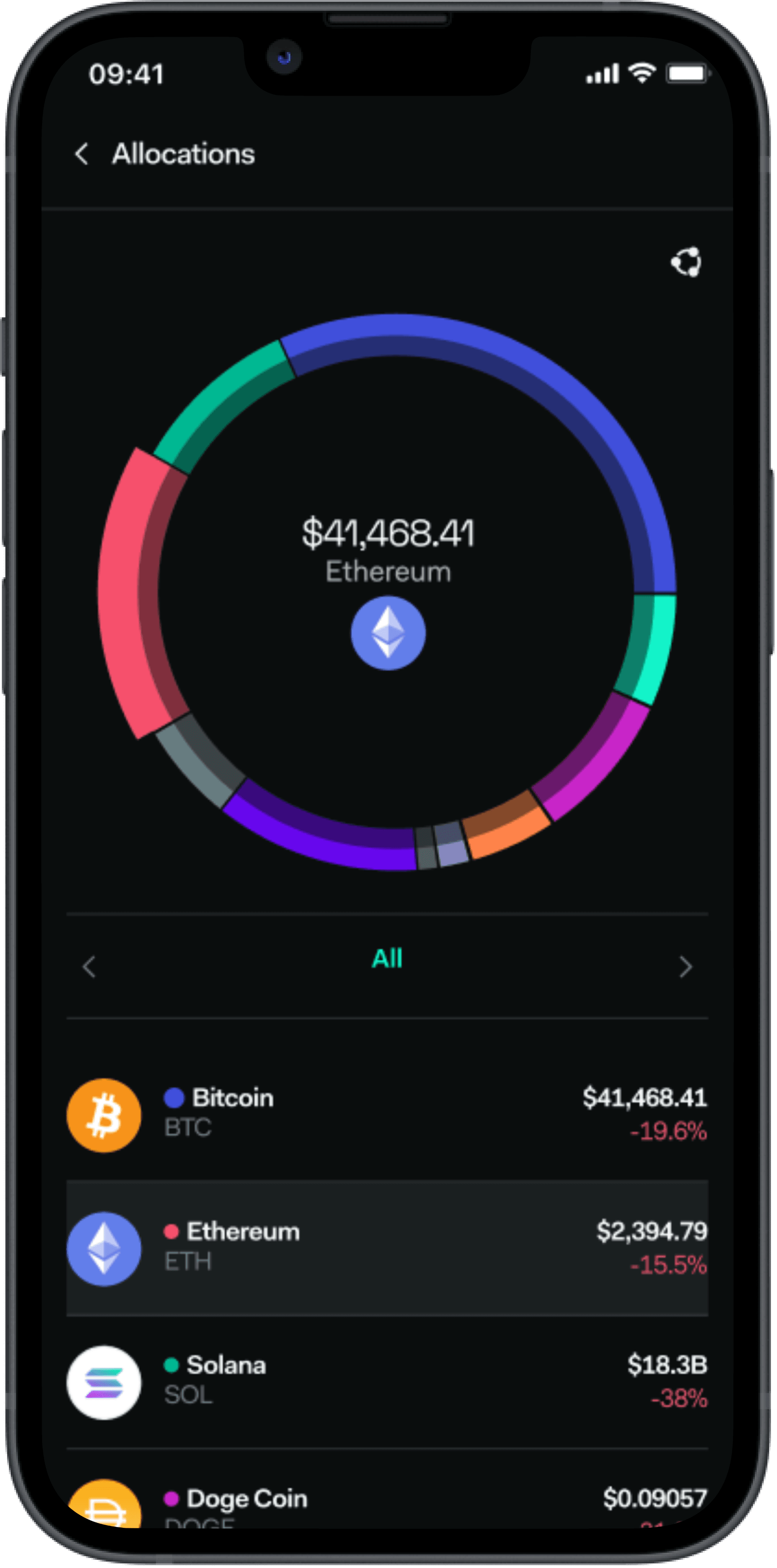
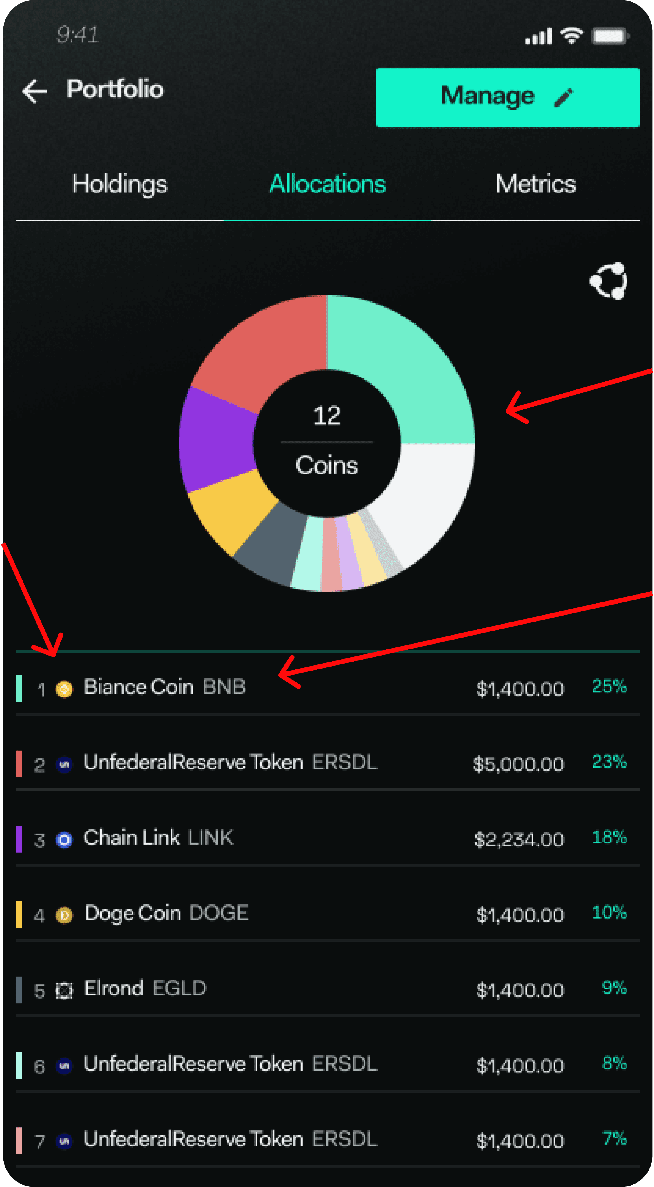
Mobile Allocations
Defining The Problem
Brief:
The portfolio hadn’t been updated in over a year and was seeing very low engagement.
My job was to identify user pain points in the current portfolio experience and design solutions.
Research Method:
User Interviews, Surveys
Results:
In our research, we conducted five user interviews and gathered 100 user responses from surveys.
Problem #1
Visual Elements Not Accessible
There were visual elements of the current portfolio designs that were not accessible to all users.
Example 1
Disorienting gradients made charts difficult to read.
Example 2
Font and icon sizes too small. Hard to read and understand.
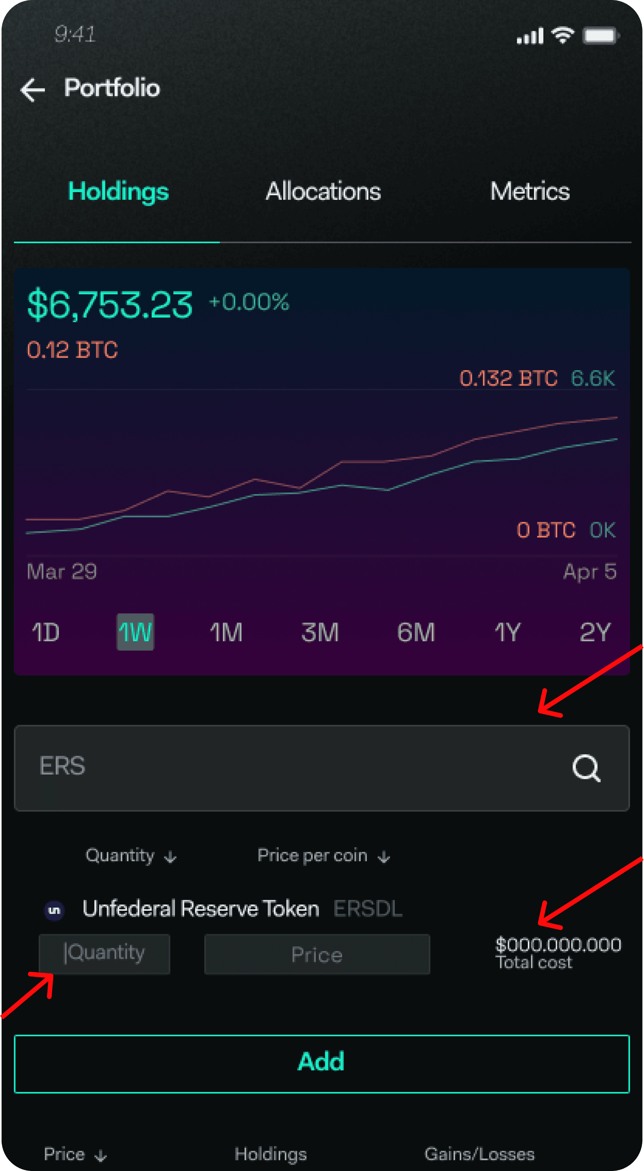
Problem #2
Difficult Onboarding Process
In the existing portfolio feature, users could only track their assets by manual entry as we didn’t yet facilitate third-party account connections.
Example 1
Users had to manually enter the exact amount of an asset they bought and the exact buy price.
Example 2
The portfolio was often inaccurate and allowed room for human error.
Problem #3
Low Value Allocations Page
The allocations page wasn’t deemed useful by users. There were also accessibility problems on this page.
Example 1
Small icon sizes made the allocations wheel difficult to read.
Example 2
The design of the wheel chart needed a modern refresh to add visual flare.
How Is This Impacting The Business?
Design Process
After identifying solutions and collecting research, we began working in 2-week design sprints, breaking it into distinct phases: shaping, exploration, design polish, QA, and launch.
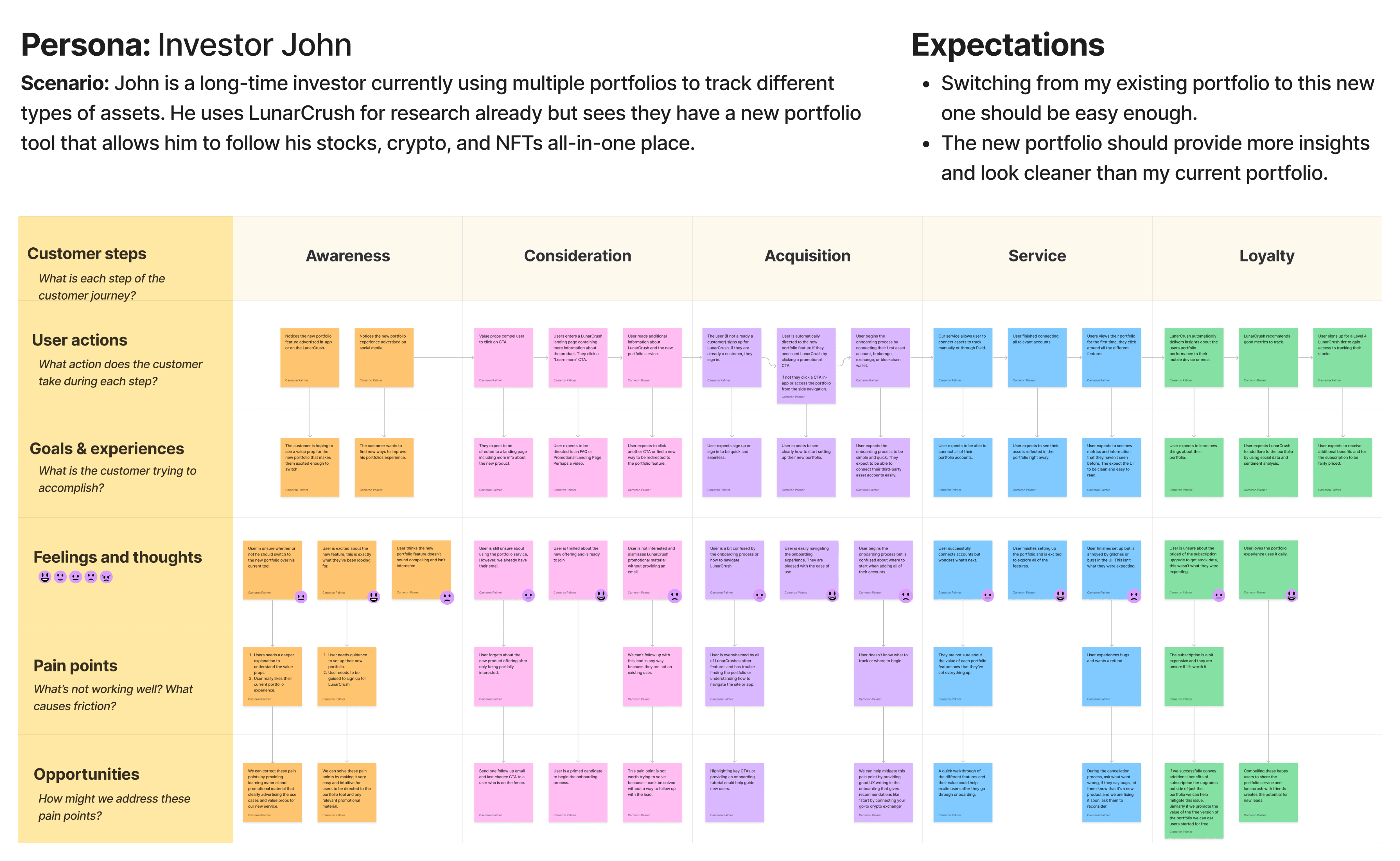
User Journey Mapping
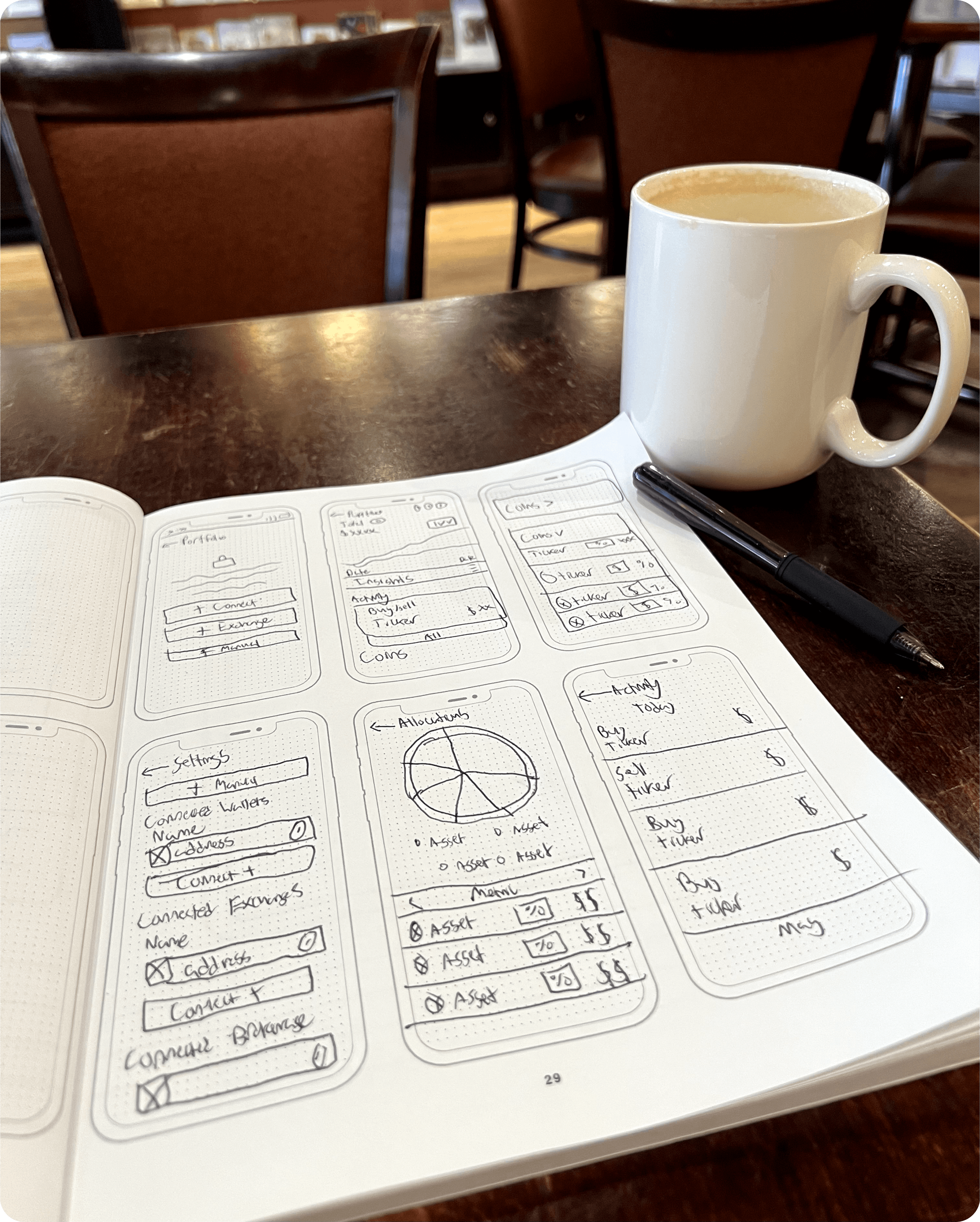
Sketches
I make sketches for my own use when strategizing the first version of any UI.
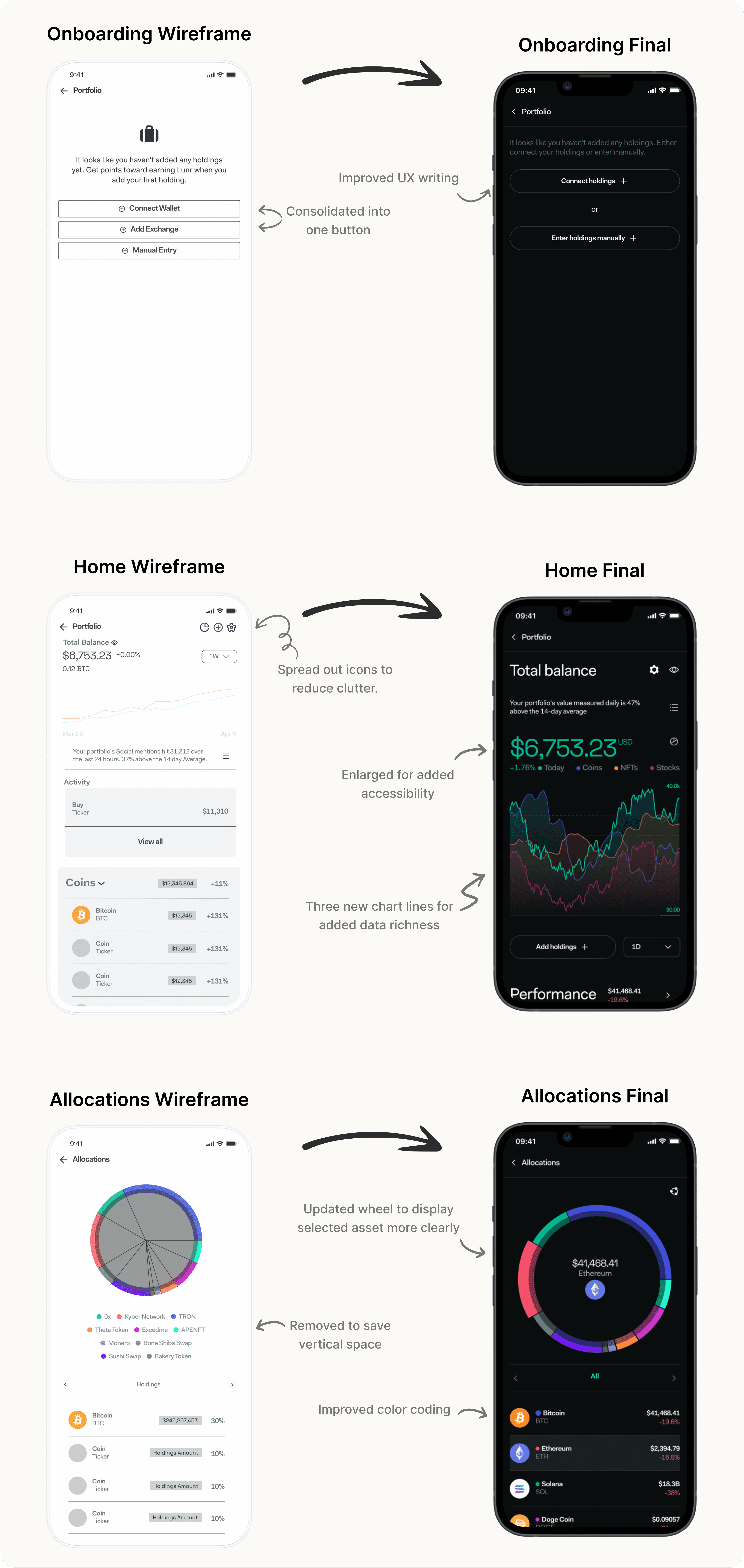
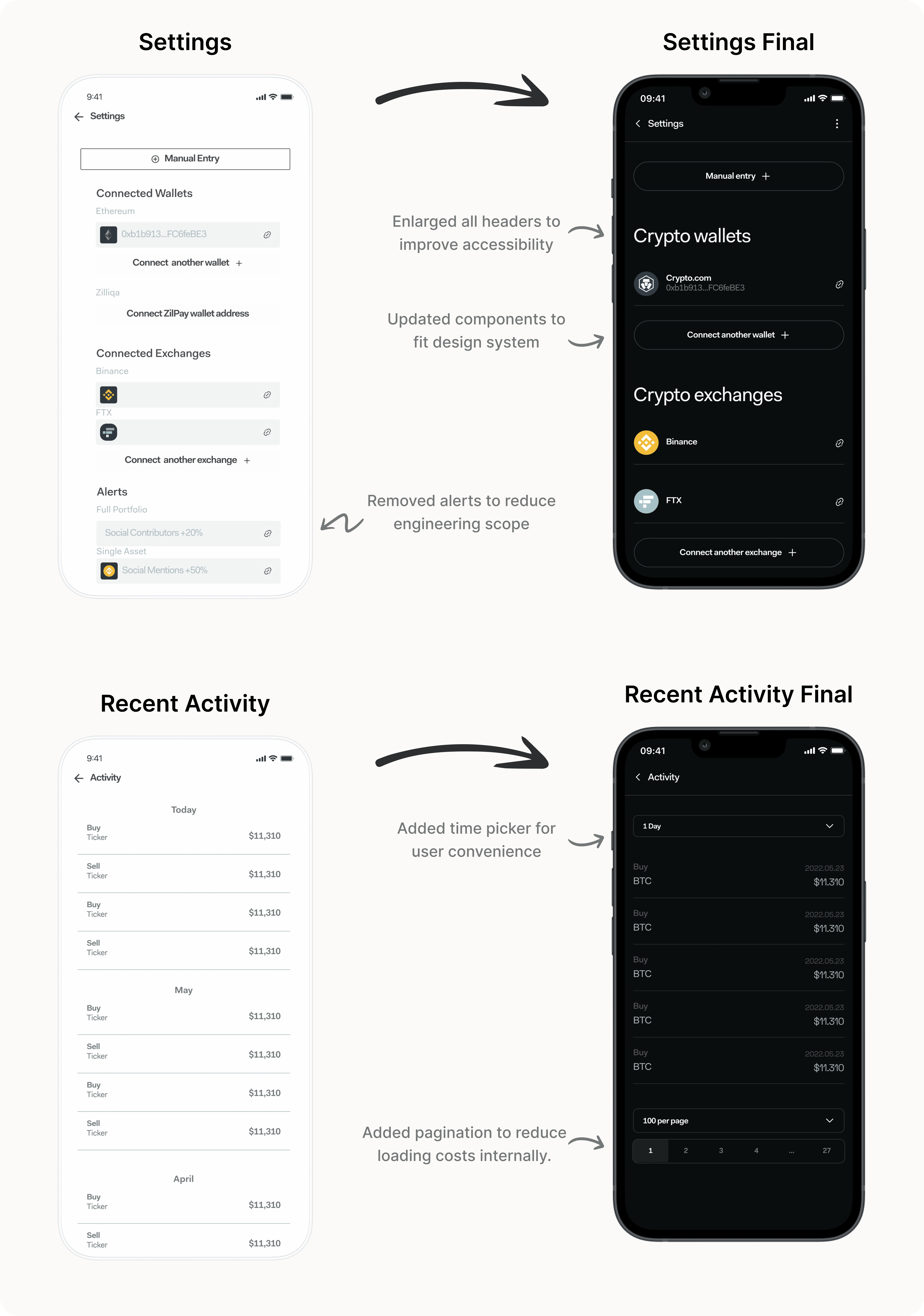
Early Designs
After defining the necessary core experiences, I created low-fidelity wireframes that would go through multiple team workshops before becoming finalized designs and prototypes.
Workshops & Feedback Implementation
The wireframes went through multiple iterations after a series of 3 team design exploration workshops.