KPiQ - Marketing Intelligence Platform
Summary:
During my time at Rocket Fuel Labs, I was a leading designer for their new AI-powered marketing intelligence platform product called KPiQ.
I assisted with the ideation, design implementation, and development of KPiQ's MVP features.
Duration:
6 months
My role:
Product Designer
Sectors:
Marketing, SaaS, AI, Startup
Defining The MVP
Target Audience:
Business owners (with or without marketing expertise) and career marketing professionals.
Problem Definition:
Companies have more marketing data than ever but less time to organize that data and gather insights from it. This is where KPiQ comes in.
How KPiQ Solves This:
KPiQ automatically organizes all your marketing data and delivers AI-powered analysis and recommendations based on your budget and revenue goals using easy-to-digest visualizations and simple language.
Core Experience #1
Home
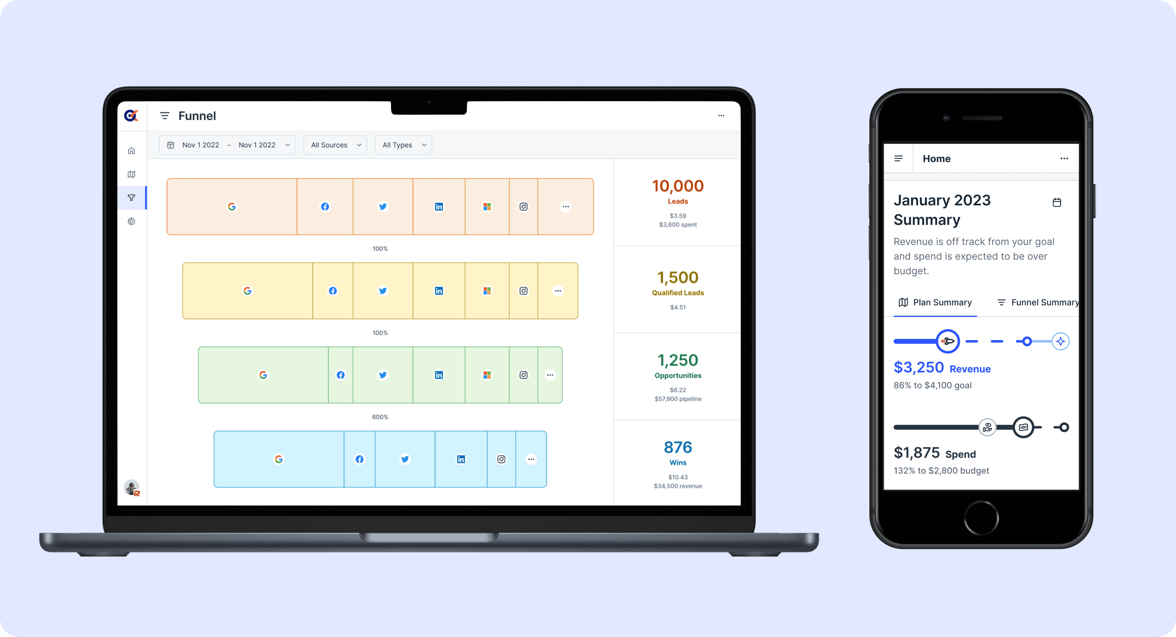
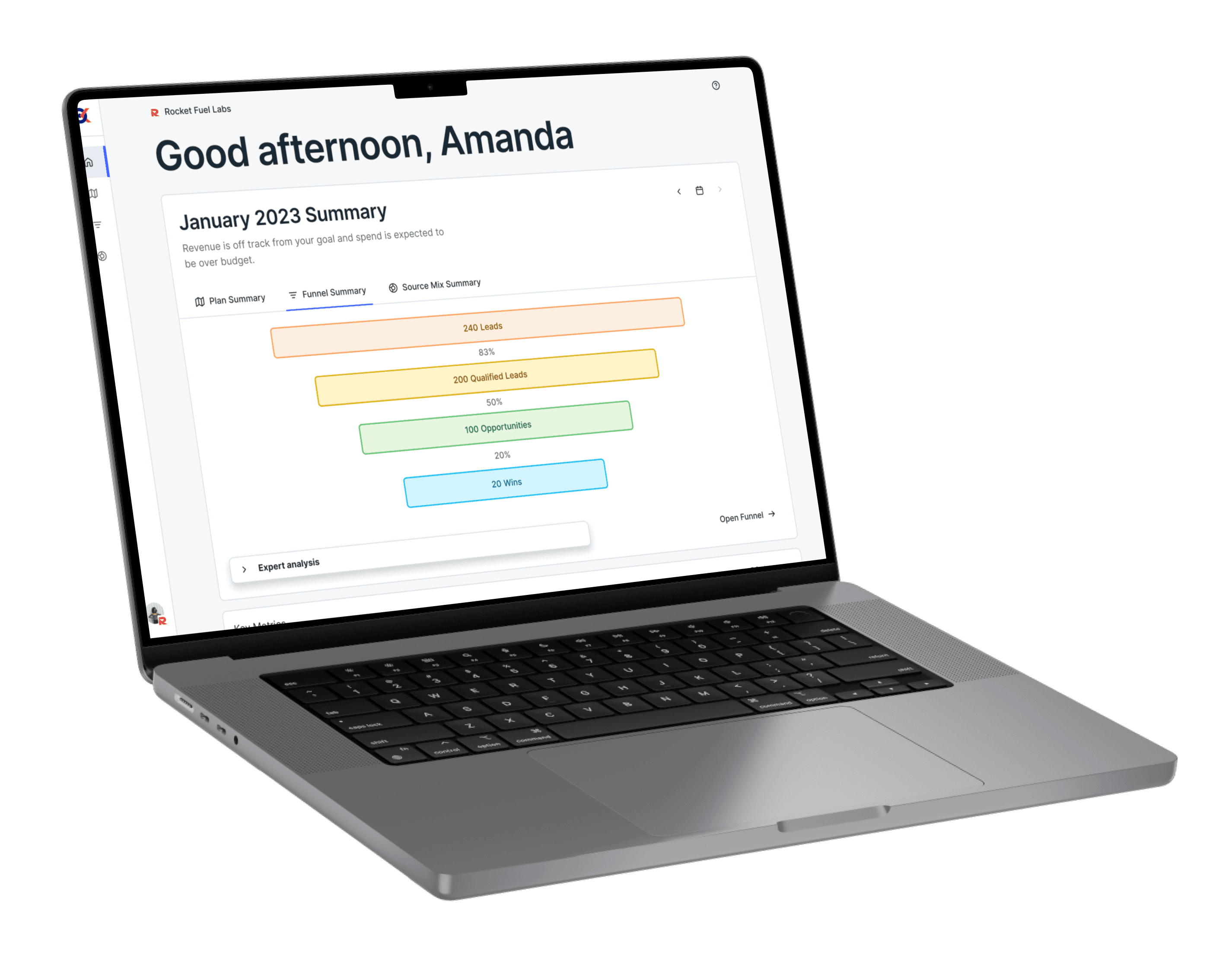
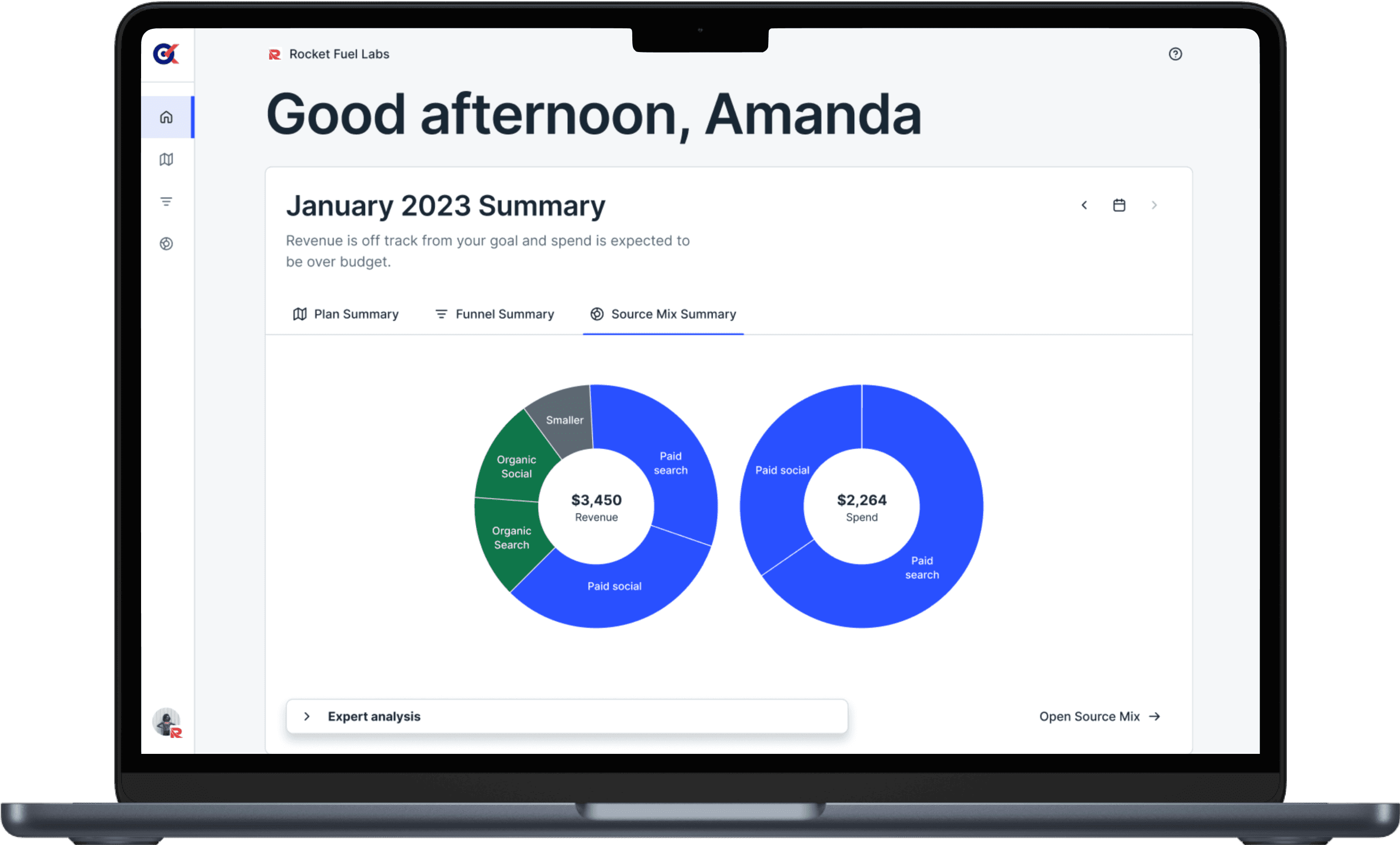
The “Home” feature gives users a bird’s-eye view of their marketing performance, highlighting the metrics that matter most to help them stay on track and hit their numbers.
A central hub for users that allows them to see important overviews, events, and AI-powered expert analysis insights related to their marketing performance at a glance.
Core Experience #2
Funnel
A customizable visualization tool that allows users to see where their marketing efforts are succeeding and where they are struggling.
Core Experience #3
Plan
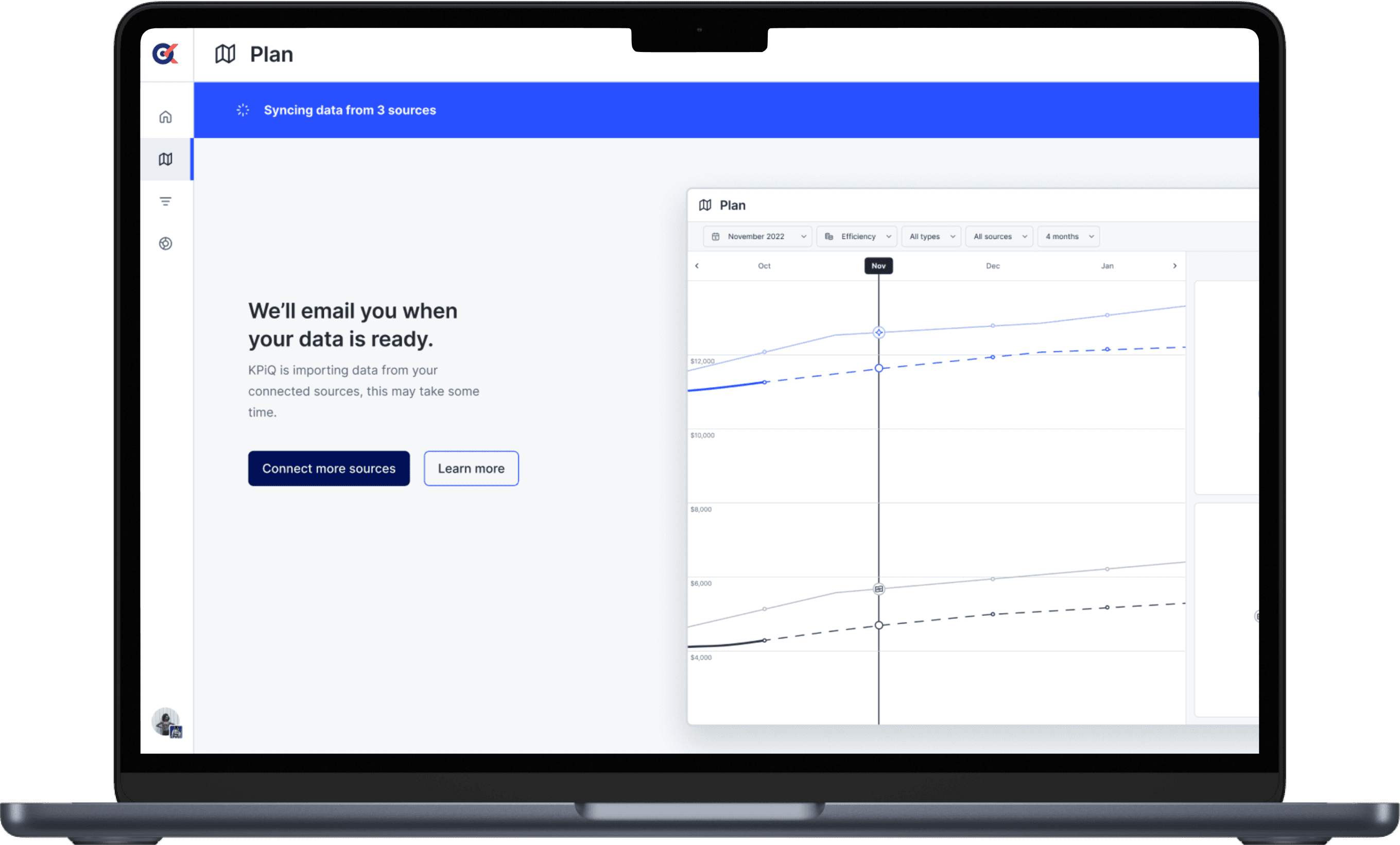
The “Plan” feature is designed to show users a forecast of their actual revenue and marketing spend compared to their forecasted spend and revenue based on the goals they’ve set. This tool helps users build a marketing plan and track its performance against clear historical data.
Design Process
After identifying key opportunities and defining our MVP, we began working in 2-week design sprints, breaking it into distinct phases: shaping, exploration, and design polish.
Research Methods:
Our team tested all potential design solutions with usability tests, A/B testing, user interviews, and surveys before final development and launch.
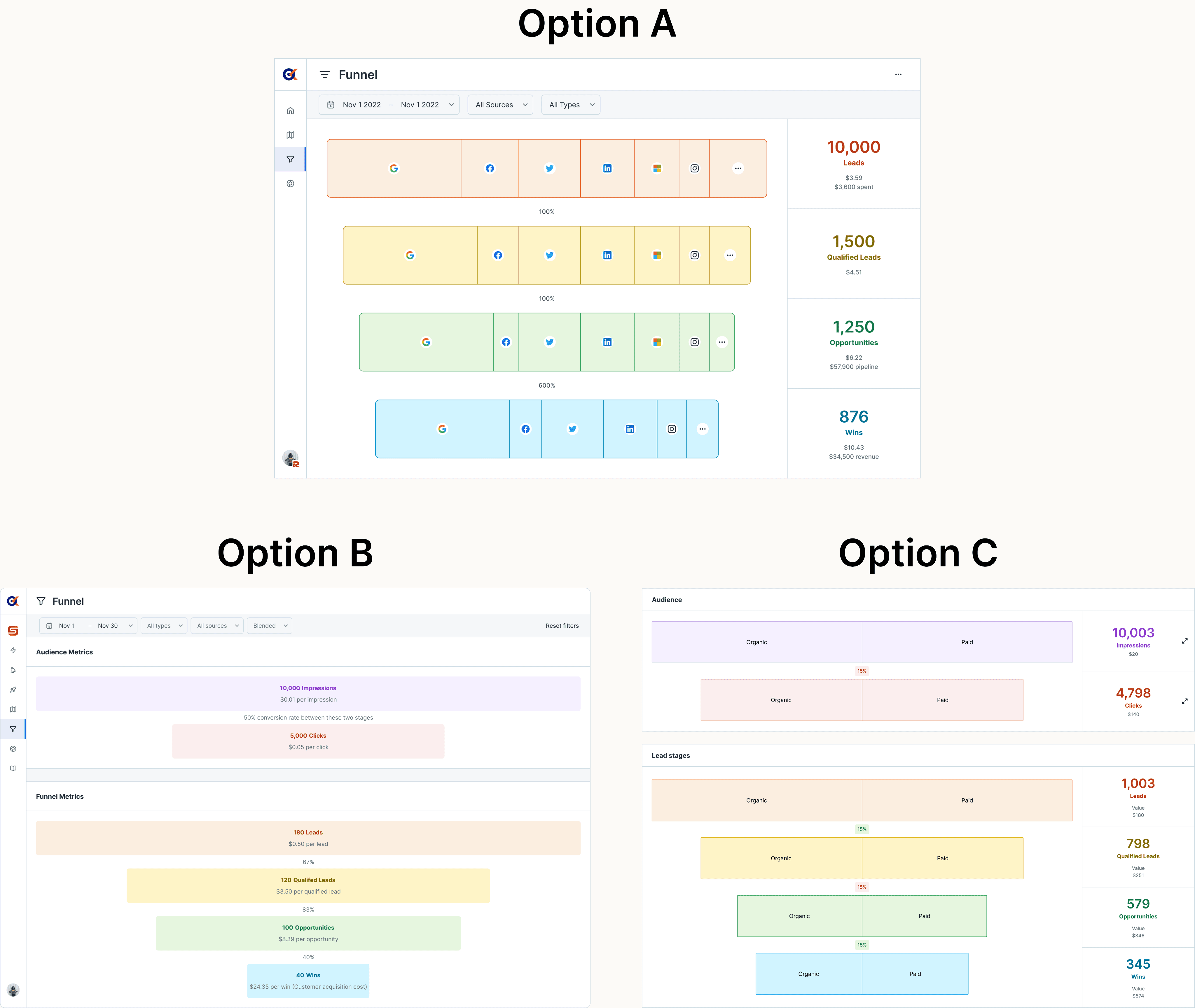
Early UI Exploration
When I host design workshops, I always present multiple options for design consideration and outline key discussion topics ahead of time to keep meetings productive and focused.
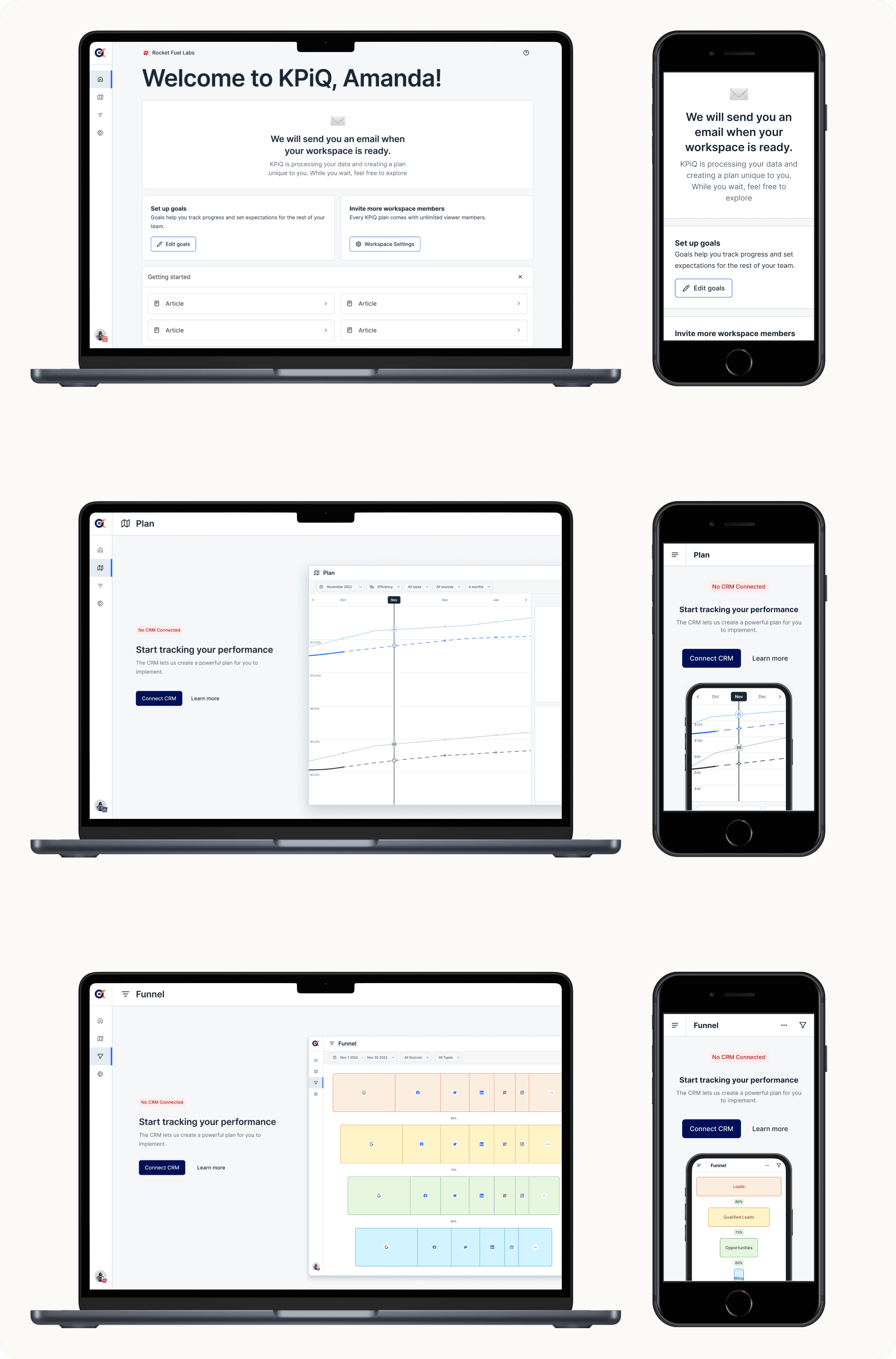
Empty States + Onboarding Flows
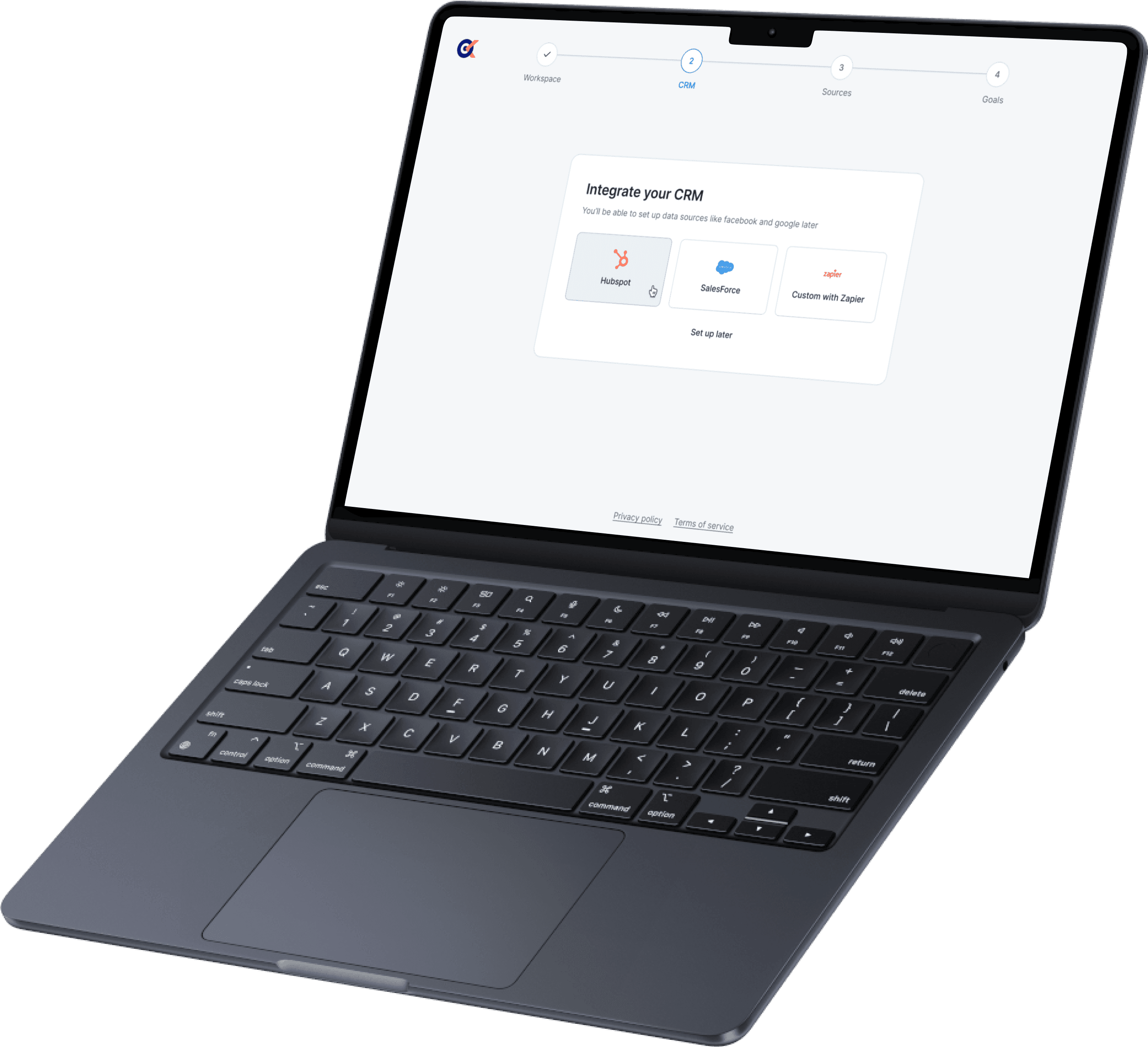
One key aspect of my role in this project was thinking through onboarding and all potential empty states that could occur as users navigate signing up and importing their marketing data into a new tool.
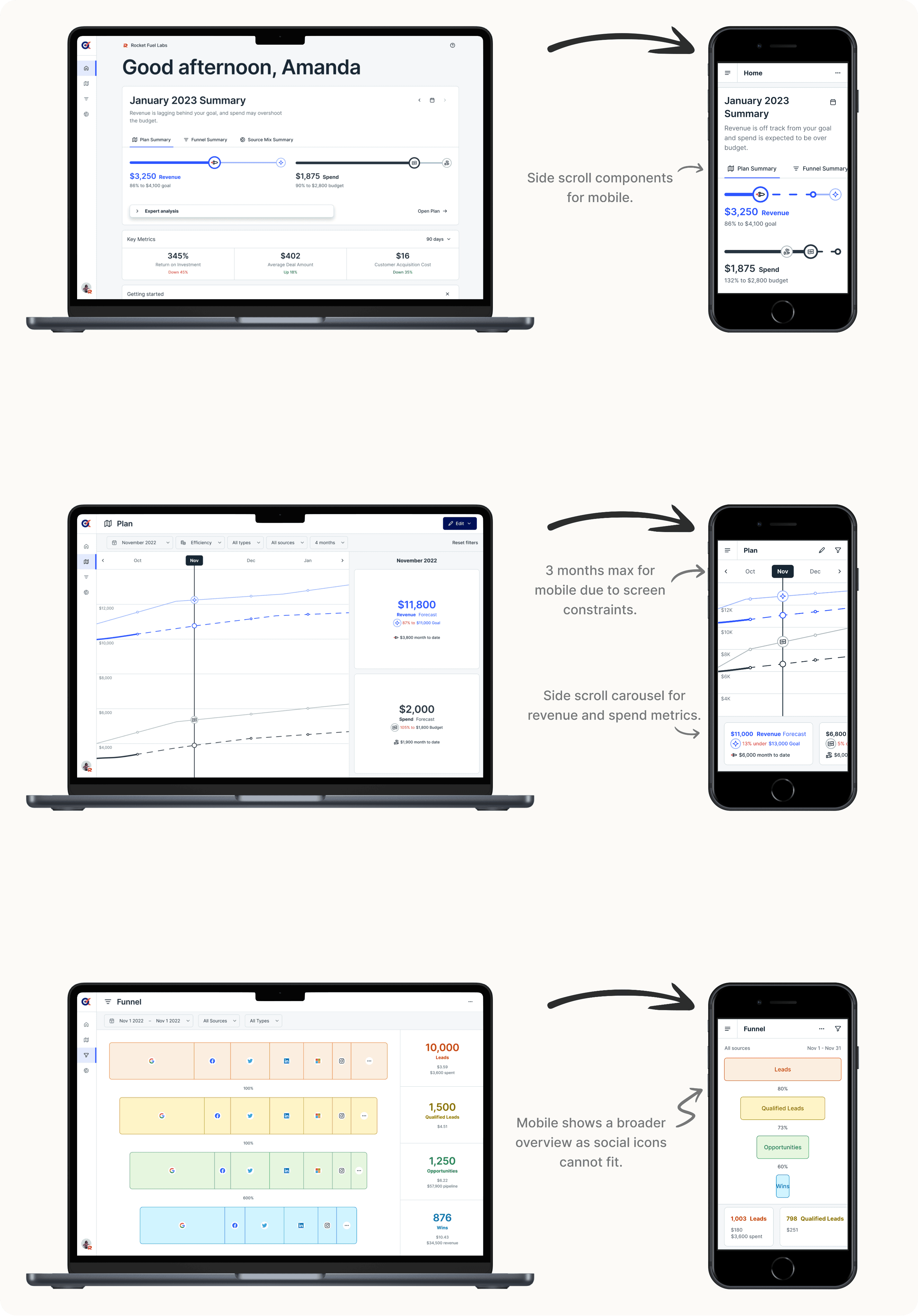
Making Designs Responsive
KPiQ was primarily designed as a web product for its MVP, with plans for native mobile app expansion in the future.
After our team finalized UI strategies based on the results of our usability tests, it was my job to ensure all web designs were responsive to mobile browsers.
Measurable Results
KPiQ launched as an open beta in May 2023. To help us gauge user responses to the new product, we conducted five usability test interviews and received 85 survey results.
of users could navigate the MVP easily.
of surveyed users planned to sign in to KPiQ to check their performance regularly.
of users were able to sign up and navigate onboarding without hangups.
